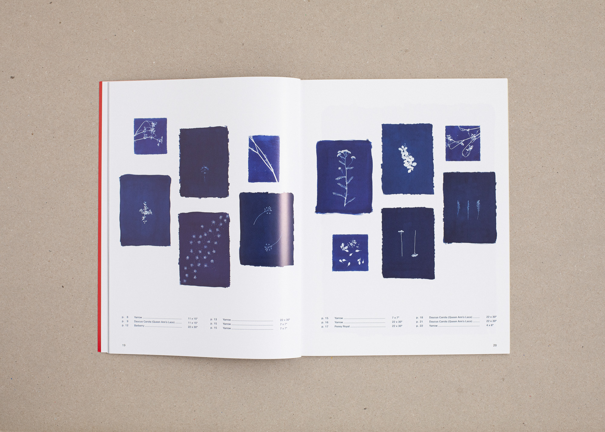
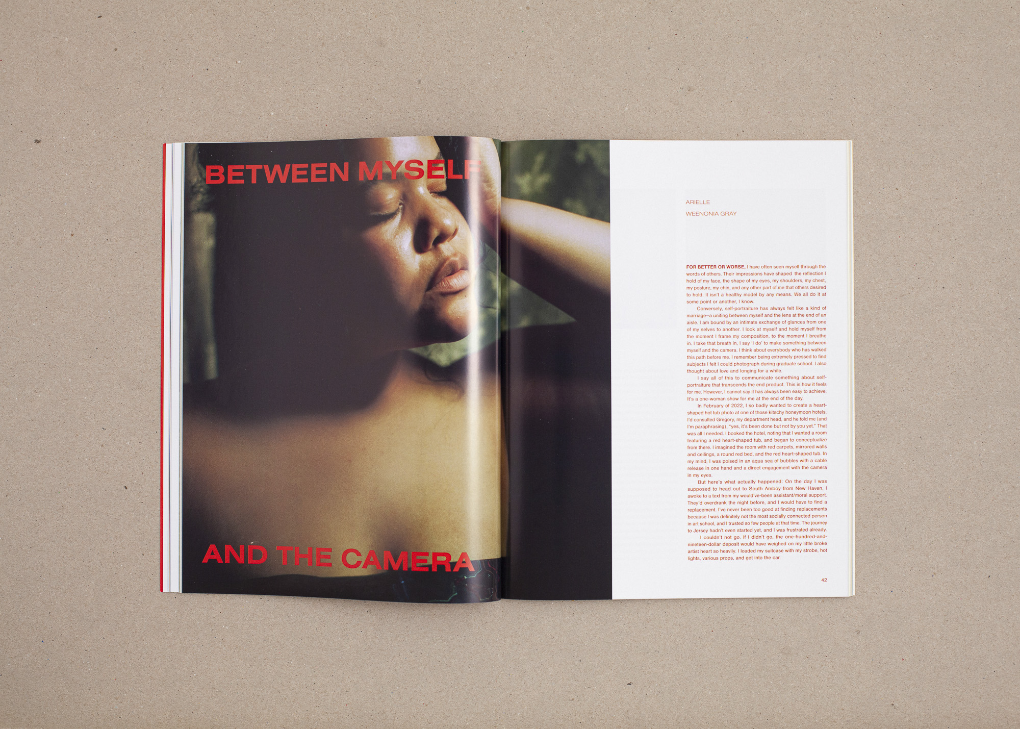
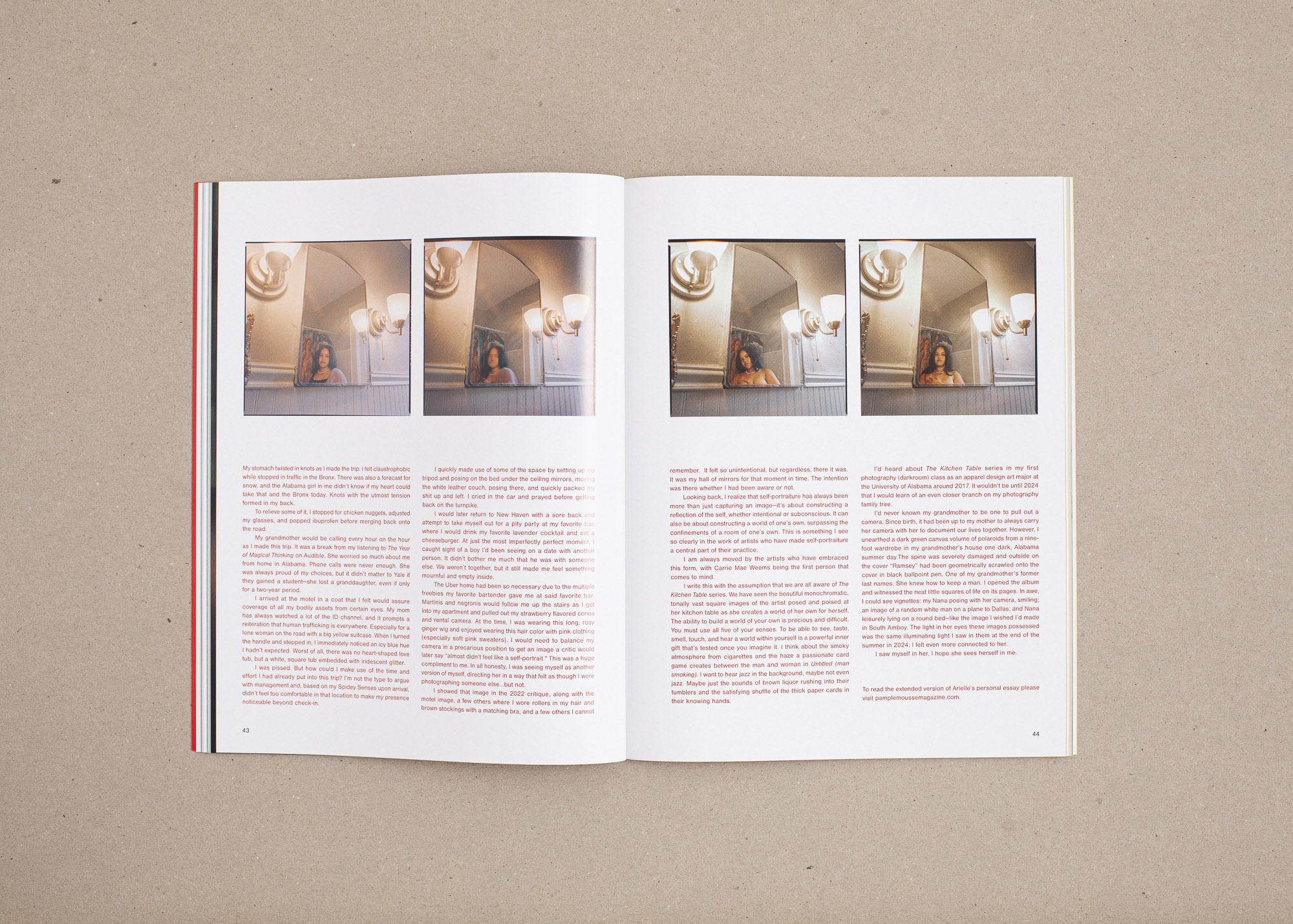
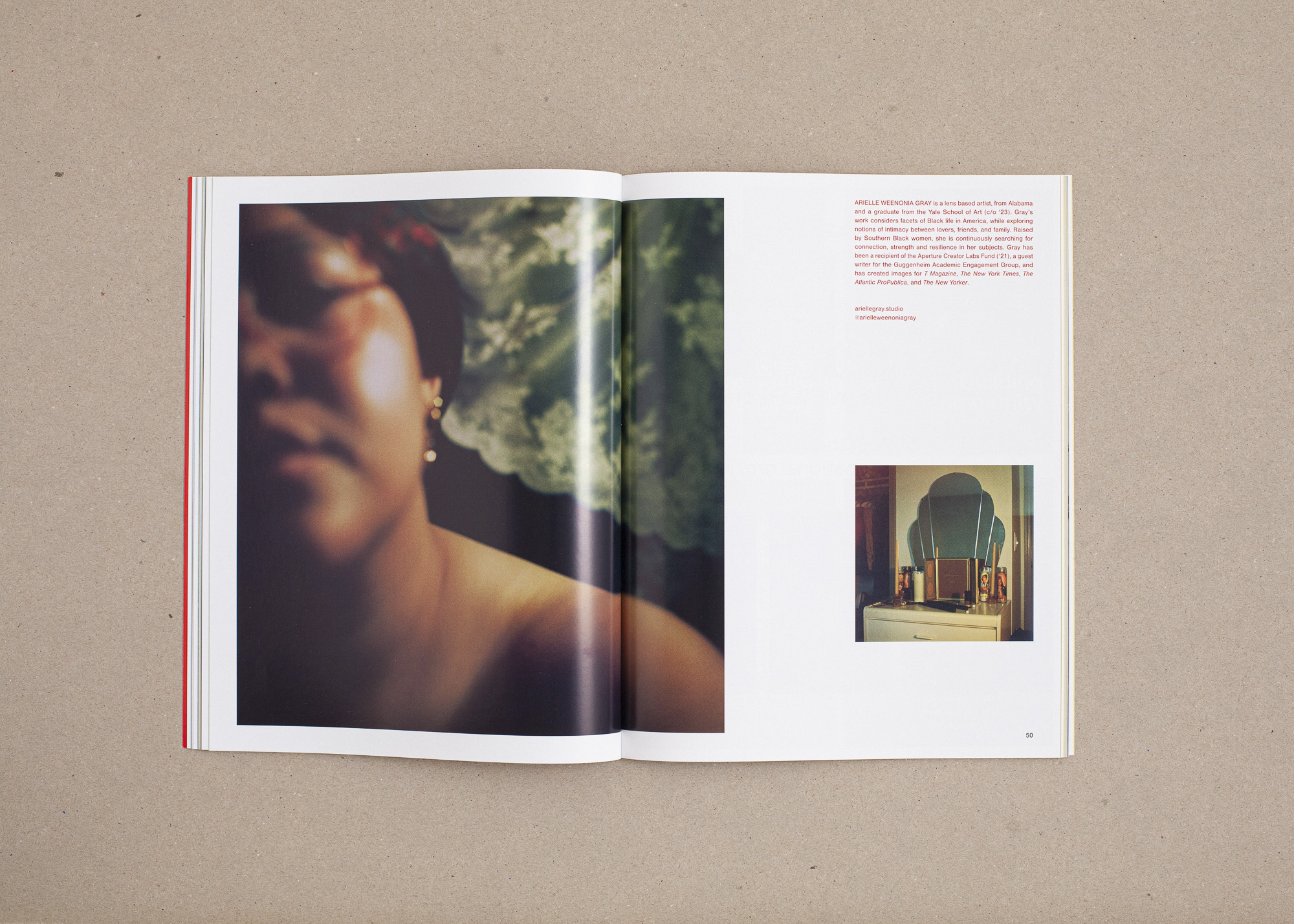
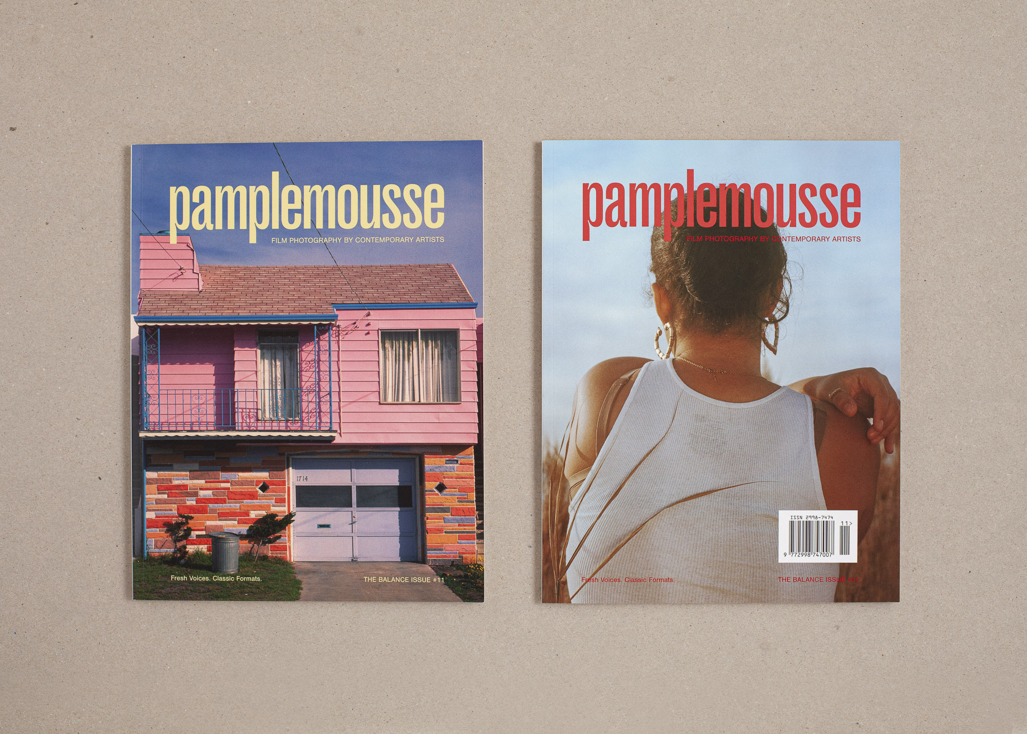
PAMPLEMOUSSE, ISSUE 11
Nora Lalle
Sasha Netchaev, logotype
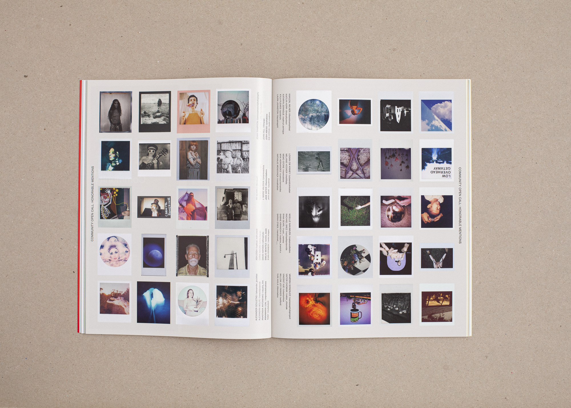
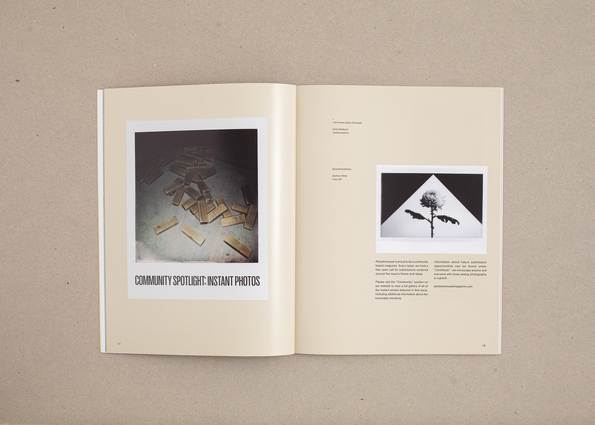
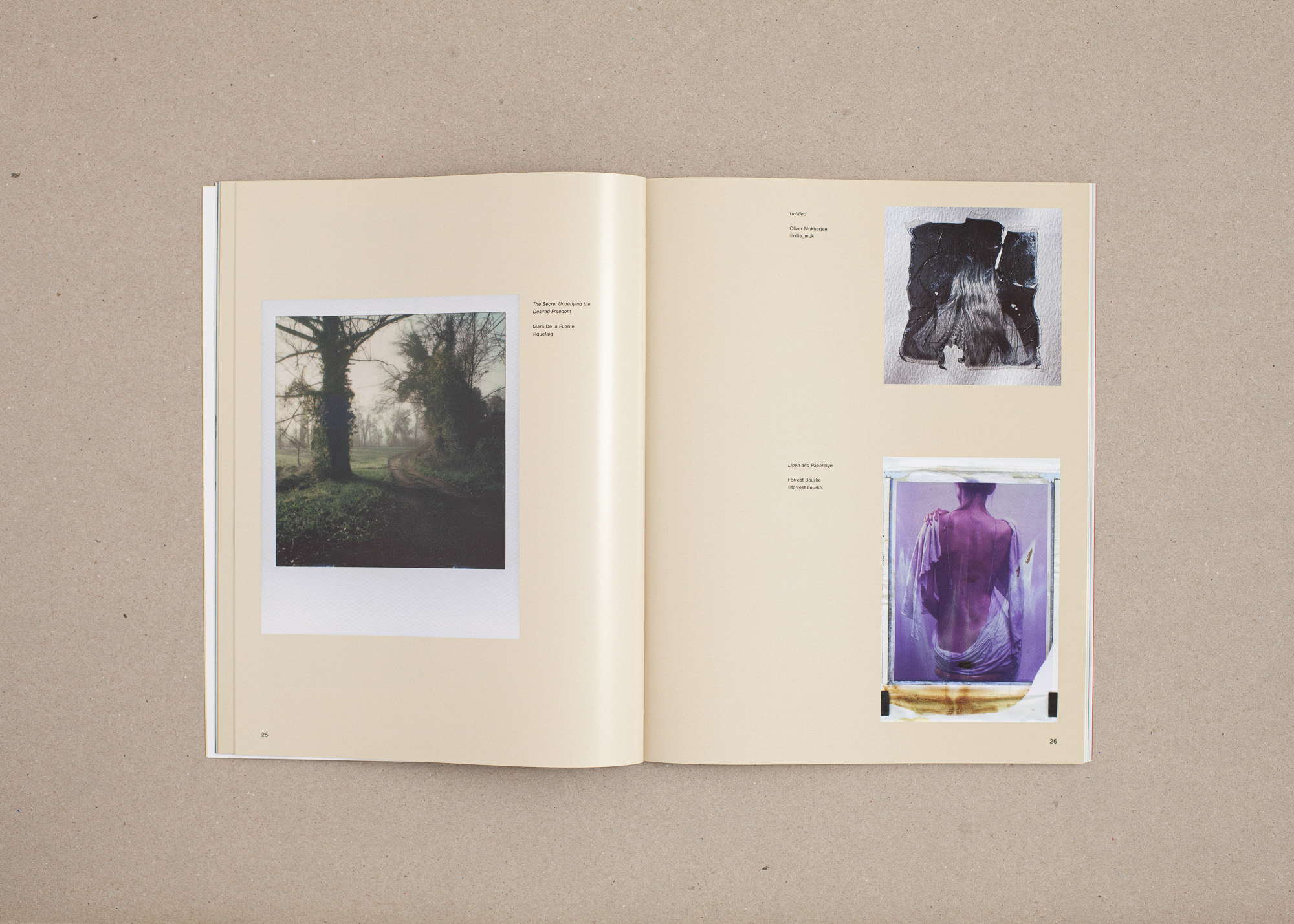
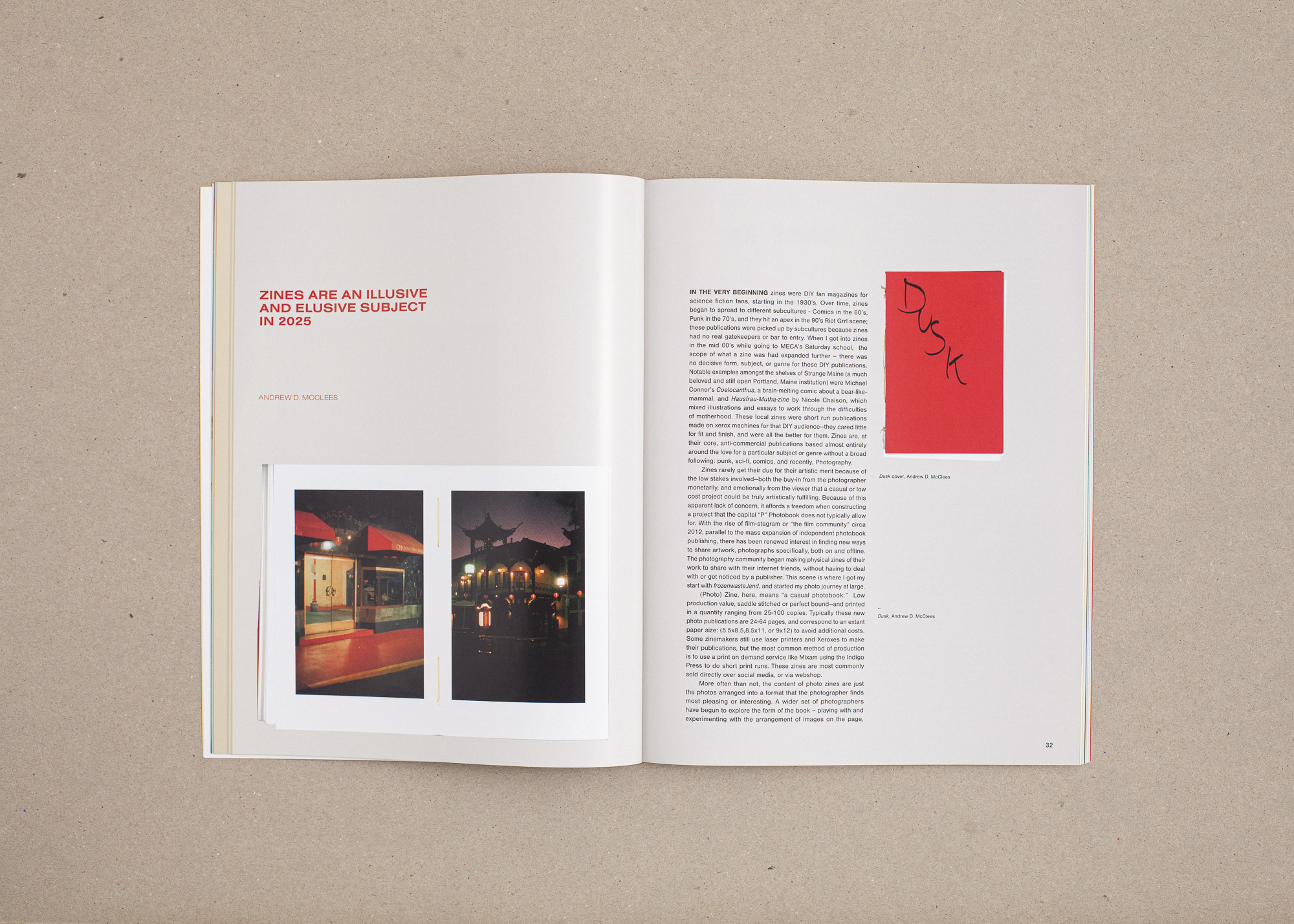
Founded by Nora Lalle, Pamplemousse is an independent print magazine dedicated to film photography and analog art. Each issue highlights the work of both emerging and established artists, offering a space for creative expression and voices that deserve more visibility.
Process:
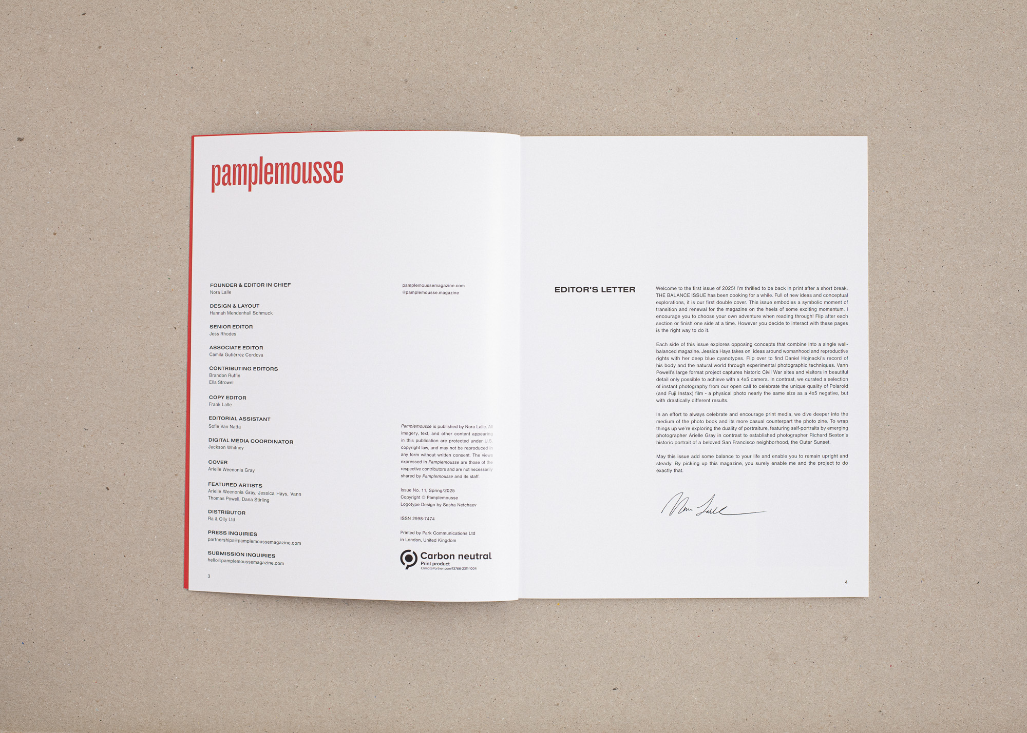
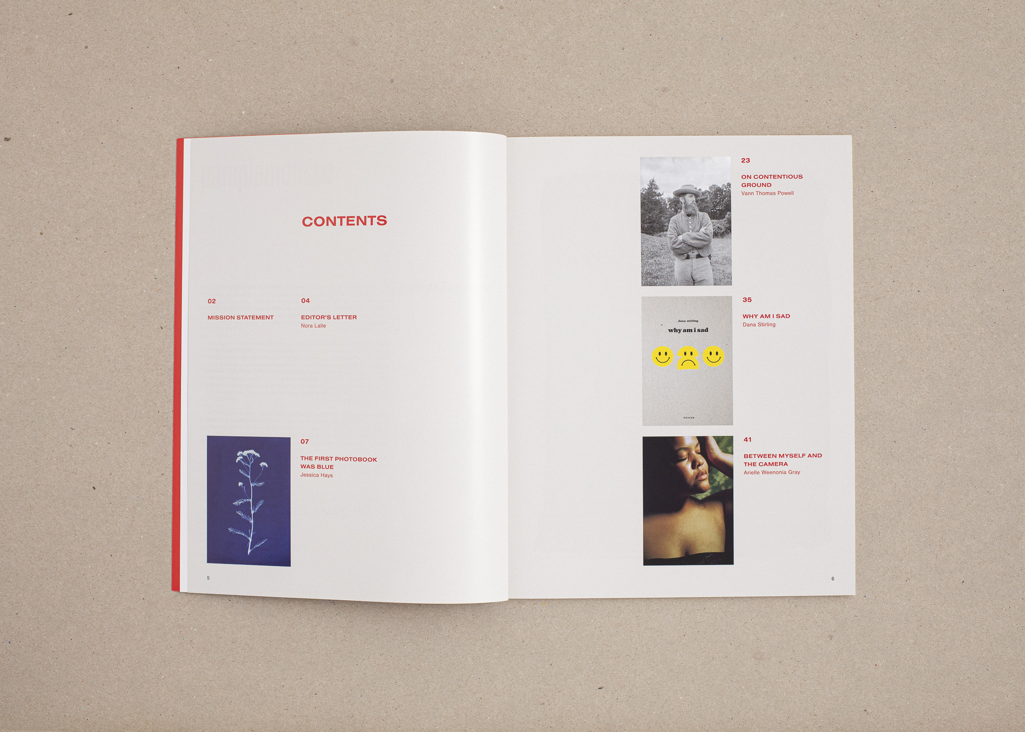
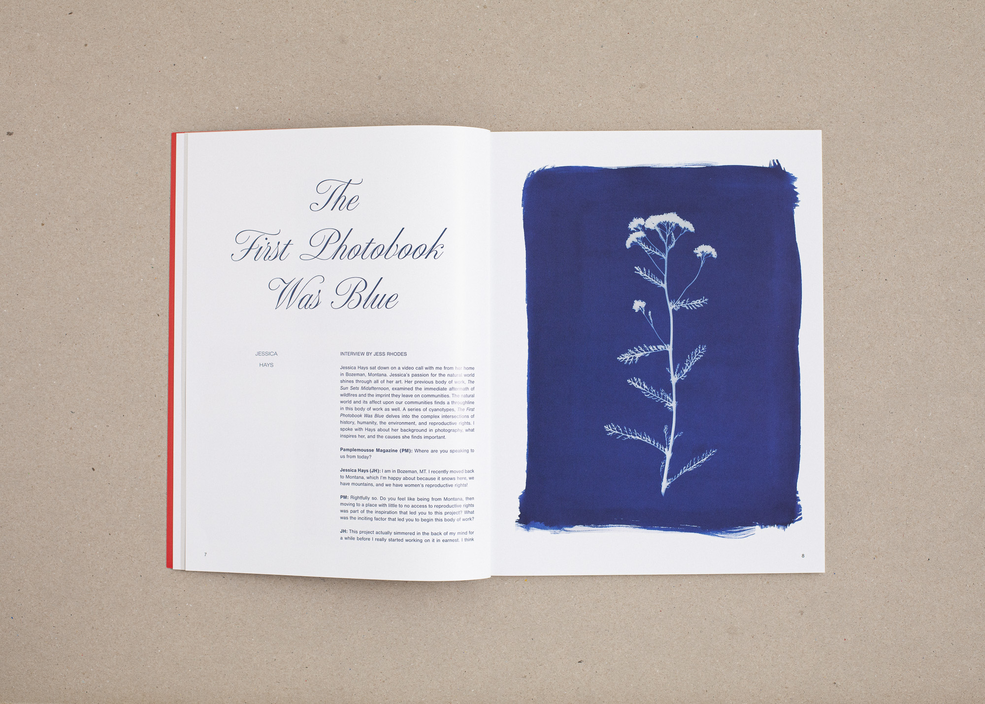
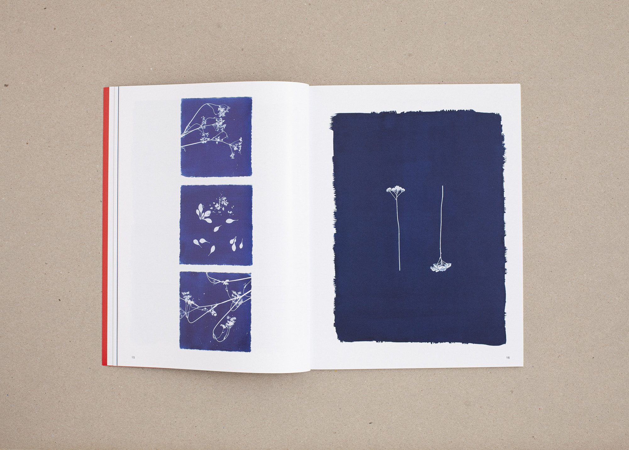
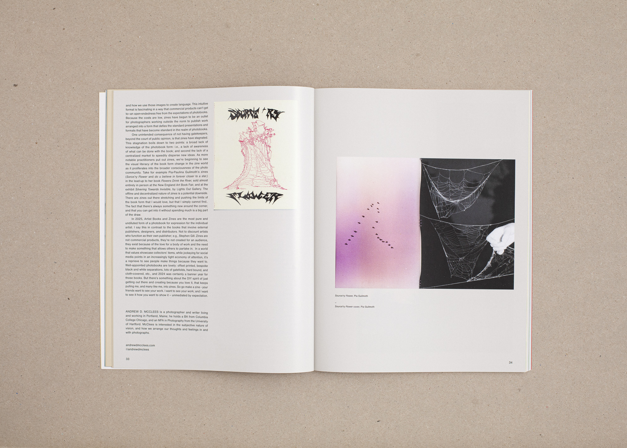
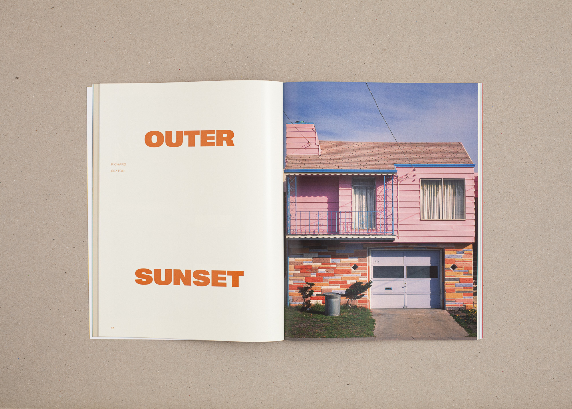
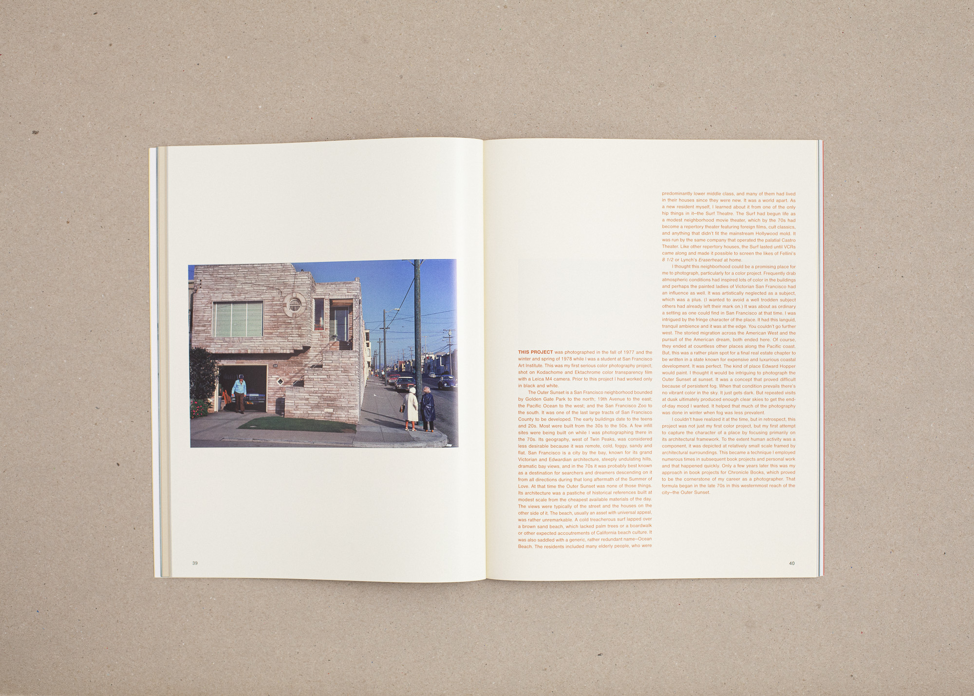
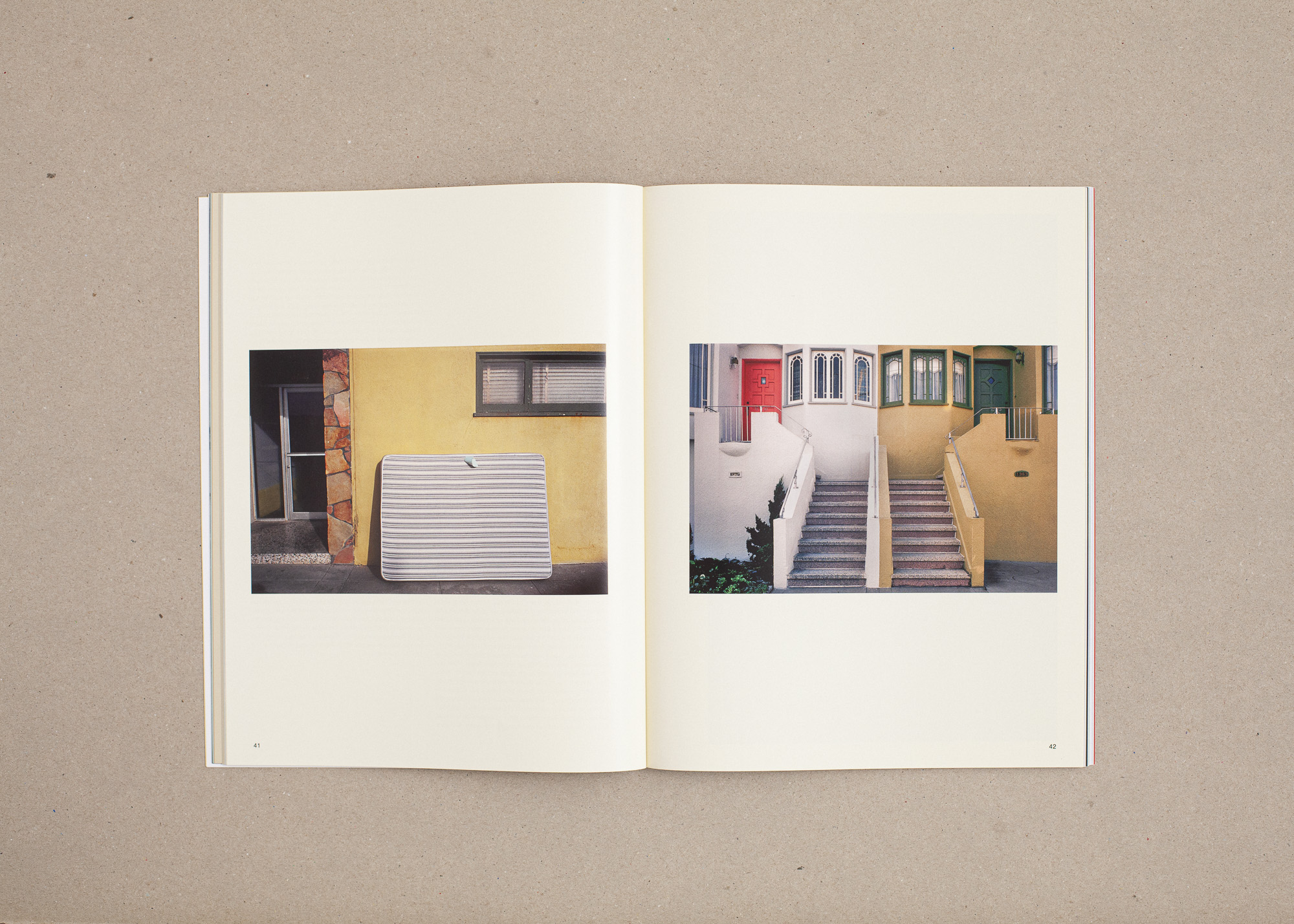
Nora approached me with a vision to refresh the look of Pamplemousse while maintaining elements of the existing brand identity, including the logotype used on the cover. The Spring 2025 issue centered on the theme of balance, and one unique design challenge was that the issue would have two covers—requiring readers to flip the magazine to view each side right side up. A tactile nod to the issue’s theme, the format allows two visually opposite stories to unfold while remaining in conversation. A few examples include contrasts between feminine and masculine, large format and Polaroid.
